Logos are the most obvious public face of your organization, app, product, you name it. While they are not the reasons most people buy your product, there is power in a logo. Some companies like Apple, Nike, McDonald’s, and Amazon are known for the simplicity of their icon alone. And while those companies have made slight changes to their logos and branding through the years, the changes were minute enough that you barely gave them a second thought, if you noticed it at all.


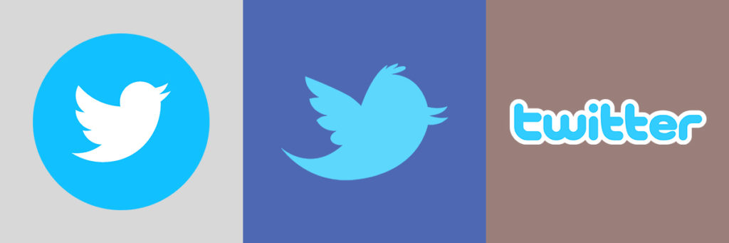
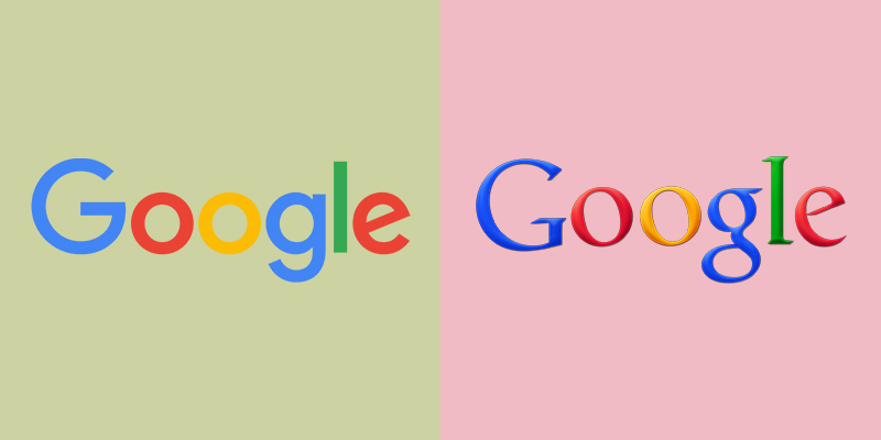
But don’t assume that all big-name companies made a logo one time and left it alone for good. Some big brands like Google, Twitter, Instagram, and YouTube have undergone major changes in their logo while maintaining certain elements of their brands (color schemes, etc.)

You may be out there wondering if you should update your logo. Maybe you didn’t have a lot of money when you started out, so you got the best logo design you could on Fiverr or used a generic logo design from PlaceIt. Now that you’re gaining a following, you may feel it’s time to make an upgrade or change the logo entirely.
Or maybe you have a great logo and it seems to stand the test of time. How do you know if you should leave it alone?
How To Know If You Should Leave Your Logo Alone
Sometimes, like with Apple or Facebook or McDonald’s or Starbucks, you may decide to leave the major look and feel of your icon the same, but can still find other, less noticeable ways to update your fonts and taglines without rebranding with a whole new logo.
So while you might want to leave your logo alone, this doesn’t mean you can’t modify small things that will be more consistent with who you’re trying to reach today.
Reasons Why You Should Leave Your Logo Alone
- It Needs to Grow on People – The company or app has grown enough that your audience should have time to get familiar with it.
- Confusing to Your Audience – Too many major changes to the look and feel of your logo or brand will result in confusion among your audience. When companies undergo a major branding shift, they have thought it through and have strategically considered how to keep their audience from getting confused.
- Backlash! In the days of YouTube Comments and Mean Tweets, fans of organizations get irate if their beloved brands make too many changes.
- If It Works, Keep it! It’s perfectly fine just the way it is. If it ain’t broke, don’t fix it.
As a side note: While I am often a fan of vintage and retro fonts and looks making a comeback, I advise you to be wary of trends. Trending looks like vintage fonts and colors may work for a particular product line or a poster or even a blog, but as a rule, I caution you against using them as a logo. Remember fifteen years ago how cool it looked for websites and Operating Systems to have aqua-like buttons with lens flares and shiny glass overlays? Your icons were expected to be realistic and lifelike and extremely busy and colorful (see examples below). Then, the trend shifted to minimalist graphics and layouts and some people needed to update their apps or marketing, and it was NOT cheap.
Bottom line about retro and trends in general? If you want to make something relevant for the month or year, it’s fine. But avoid this for your logo.
How to Know It’s Definitely Time for a Logo Change
Then, there are times when you know it is definitely time to make a change to your logo and brand. Whether you’re new at a company that hasn’t updated their logo since the Taft administration, or the outdated logo just doesn’t look relevant anymore, you may be looking to revamp the look and feel of your organization or product.
Reasons Why You Should Change Your Logo
- Outdated – Everything about your current logo just screams 1970s, or Windows 95-era Clip-Art. Yes, sometimes retro-looking logos make a comeback and in some instances, a vintage looking logo from out of the 1950s works for a modern day barber shop.
- Stand Out From Competitors – As much as we’ve tried to tell you not to judge a book by its cover, people DO! First impressions matter, and if your competitors are killing you in sales, their branding may have something to do with it. A key piece of advice is to study the leading brands in your industry and niche. How do they look? How is their branding? Is it simple and easy to remember them by? Do something similar to them. Not copying their branding or design, but make similar adjustments in the way you market your own.
- Change with the Times – In the early days of Apple, their legal name was Apple Computers, Inc. When they began shifting their focus to mobile phones, iPads, and Apple TV, they changed their name to simply Apple, Inc. Dunkin Donuts is currently ousting the ‘Donuts’ part of their name since they’ve shifted their focus to coffee. You’d better believe this one will result in a change to their logo. As your business, app, or website grows, you may need to change your logo to keep up with where you’re going.
- It Needs to Be Simpler – Yes, the current trend toward minimalist design is popular right now, and it may be trendy, but this is one trend that doesn’t go out of style. Just like there are trendy jeans depending on the decade – stonewashed, distressed, bling, and cargo pockets – there will always be the classic five-pocket denim that will never go out of style.
Questions You Should Ask Yourself About a Logo Change
When making the decision to update your logo, here are some questions you should ask yourself.
Is My Logo Easy to Understand?
With Apple, their logo is straight forward. With Nike, the swish (check mark) is synonymous with their tagline “Just do it.” Burger King’s logo is shaped and colored like a giant burger. These are monstrous companies, but their logo tells a little story and is quickly identified. The capital “C” in Chick-Fil-A is the face of a chicken. Your logo needs to be simple, but it also should identify who you are.
How Does My Logo Differentiate from my Competitors?
Remember when I said to pay attention to the top brands in your niche? It’s likely their logo tells a brief story who who they are as an organization. Let this serve as inspiration and then let your logo be uniquely you. Because of this, stay away from pre-designed logos like PlaceIt. There’s nothing wrong with these designs, but chances are, there are a lot of other people who have purchased the same ones without updating anything. Don’t be them. Be you!
Will This Logo Remain Relevant When the Trends Change?
Remember when Google changed their logo? How about Walmart? They were due for an upgrade – Google because it needed to simplify its brand as they’re supposed to be ‘all things simple’ and Walmart because they needed to break away from their NRA/back-woods/’Murica reputation, and they opted for a more modern and simple look with a softer color-scheme that made them seem more ‘welcome to anyone.’ But they won’t be changing these logos every year or two. Changes like these are not so much for trends as they are that it was just time. Will your logo be simple enough that you don’t NEED a redesign every two years when the trends change?
In Conclusion:
Logo design is one of the most critical elements of any company’s brand. It should tell a story about who you are as a company and what you do. It should also be uniquely yours. You need a logo you can be proud of, and one that stands the test of time.
Do you agree?
Leave a comment below. And if you’re not yet subscribed to the blog, you can do so by entering your email in the box below. We send out emails with blog updates, special news, and more weekly, and we’ll never spam you.
Logos Used: